How | Tips | Answer

Friday, May 31, 2019

Biber Architects


In the Biber Architects logo, Spin takes a minimal approach to a big reveal. The logo begins with an abstract image, portraying the stem of the “i” in negative space. This concept speaks to light and dark, or the photographic and nuanced aspects of their architectural design. As the logo animates, it hides the dot of the “i” behind the second “b,” which brings even further attention to the negative space in the logo.

Thank you
  Biber Architects by Spin
Share:

Thursday, May 30, 2019

OpenView


Everyone loves a “big reveal.” It’s used in magic acts, narrative storytelling, game show prizes and even in logo design. Check out how Pentagram uses a reveal to expand on the concept of “opening” in their logo for OpenView. The logo begins with the “O” and “V” characters, then spreads them apart and reveals the full logo name in between. This use of a reveal allows the logo to transition seamlessly between its full form and its “shorthand” version.

Thank you... 

Open View by Pentagram
Share:

Wednesday, May 29, 2019

Enlicitación


This animated logo for Enlicitación spells out the company name and adds an iconographic flourish at the end. Simple, but very effective.
Thanks you
 by Maryia Dziadziulia
Share:

Zoom


This animated logo for Zoom uses rotation and map iconography to represent travel destinations around the world.
Thank you
Read More
Post by computer zoom design      
Share:

Monday, May 27, 2019

500px


Photography network 500px rebranded with this bold and playful animated logo that “evokes a fingerprint with animation that echoes the turn of a camera lens.”

Thank you
Read More
Post by computer zoomdesign    
Share:

Sunday, May 26, 2019

Terri Timely


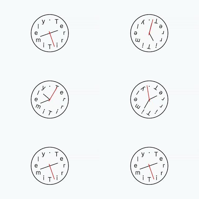
Terri Timely is a duo of directors that specialize in quirky and comedic short films. Their logo uses animated rotation to add character and personality to the logo design. All of the elements of the clock spin in a silly and rapid manner. The rotation takes a logo that is quite modest and turns it into something fun and playful.

Thank you
Read More
Post by computer zoom design        
Share:

Saturday, May 25, 2019

Giant Owl


The Giant Owl logo takes a different approach to rotation. The circular forms start by rotating like a film reel, then they blink like owl eyes. This is the practicality of animation; we wouldn’t necessarily understand what those shapes were without the movement. The animation opens up doors to logo design concepts that wouldn’t succeed with static art.
Thank you 
Read More   
Post by computer zoom design    
Share:

Friday, May 24, 2019

LUX


For investment company Lux Capital one thing is clear: make money. Design studio Mucho plays with the idea of addition, multiplication and profit by rotating the “X” in Lux. Additionally, after the “X” rotates, it rises upwards and to the right, another nod to the idea of profit.
Thank you 
  Read More
Post by computer zoom design 
Share:

Thursday, May 23, 2019

sayed image


Share:

Wednesday, May 22, 2019

Have you tried content marketing before?


Let’s say you’ve gotten the buy-in you need to make video a part of your marketing stack. Now it’s time to position yourself to create a strategy by analyzing what content initiatives (if any) you’ve tried in the past.
Are they blogs, podcasts, or email newsletters?
If you’ve tried other pieces of content in the past, analyze those results to help you set a benchmark to match or surpass with your video content.
Depending on your product this will usually be indicated by some combination of traffic to the content, referrals to your website or product page from the content and/or conversions that have resulted from those referrals.
Compile this into a spreadsheet or text document, creating ranked lists populated by content pieces that were best for traffic, referrals and conversions.
Doing this will help give you an idea of the topics and themes that work the best for your business, helping you put together your video marketing strategy and your content calendar.
Thank you
Post by computer zoom design      
Share:

Tuesday, May 21, 2019

Why do you want to invest in video marketing?


The first thing to figure out is why you think your company should be video marketing.

This is important for you to articulate for yourself, but also for the rest of the business and the higher-ups that hold the purse-strings. If some of the company’s time and money are going to be committed to producing video, what’s the opportunity?
Be as clear as you can about it in a document or presentation, reflecting on the business’ marketing efforts up until that point, and positioning video as the missing piece of your marketing stack that could bring the company’s marketing efforts to a whole other level.
Thank you
Post by computer zoom design      
Share:

Monday, May 20, 2019

ways designers can embrace personalization in 2019


I an admission to make: I don’t pay for my own Netflix account.
While I’ve embraced many of the responsibilities of adulthood—paying my own rent, waking up before 8am, and spending my hard earned cash on copious amounts of avocado toast—I’ve somehow avoided the illustrious $11 monthly charge for Netflix.
I share an account with my family, and the reason I’m fine with sharing my account is that Netflix allows each user to create a persona. When I log in, I can click my name, and confidently know that my content feed is updating based on what I’ve rated highly and enjoyed watching in the past.
You see, my feed is directly personalized for me (not for my dad, not for my sister, not for my old college roommate with my login).
Anyways, the point I’m driving home is that Netflix has a lot of data on their users. And they use it well—personalizing every experience and making the site more engaging.
When you start watching Roma on your iPad or an episode of Parks & Recreation on your TV, you can be confident that Netflix is utilizing both demographic data (your job, location, age, etc) alongside more specific user activity data (your watch history, past ratings, device type, location, etc).
Thank you
Post by computer zoom design      
Share:

Sunday, May 19, 2019

Have you tried content marketing before?

Let’s say you’ve gotten the buy-in you need to make video a part of your marketing stack. Now it’s time to position yourself to create a strategy by analyzing what content initiatives (if any) you’ve tried in the past.
Are they blogs, podcasts, or email newsletters?
If you’ve tried other pieces of content in the past, analyze those results to help you set a benchmark to match or surpass with your video content.
Depending on your product this will usually be indicated by some combination of traffic to the content, referrals to your website or product page from the content and/or conversions that have resulted from those referrals.
Compile this into a spreadsheet or text document, creating ranked lists populated by content pieces that were best for traffic, referrals and conversions.
Doing this will help give you an idea of the topics and themes that work the best for your business, helping you put together your video marketing strategy and your content calendar.
Thank 
Share:

animated GIF in Photoshop


A GIF, or “Graphics Interchange Format”, is a compressed image file format that allows for animation. There are many ways to create a GIF, but Photoshop is fast and easy, with built-in tools for image manipulation and animating.
Just like classic animation, an animated GIF is made up of a series of still images played sequentially to create the illusion of movement. Find a GIF off the internet and drag it into Photoshop, and you will see the separate frames that make up the animation. These frames are what we’re going to build in this tutorial in order to animate a killer banner ad GIF.
Thank you
Post by computer zoom design      
Share:

Saturday, May 18, 2019

What makes a good architecture logo?


You don’t want a McMansion logo: bland, trite and exactly the same as every other logo on the block. Even if your firm designs for tract housing developments or commercial suburban settings, your logo should communicate the value you deliver—not stereotypes about the kind of work you do.
So how can you do that?

Think about exactly what your firm delivers and the qualities it prides itself on. Do you focus on LEED-certified buildings? Are you a design-build firm that handles every step of the client’s project, from drafting the initial designs to laying the final brick? Don’t just think about the concrete deliverables, think about the abstract value you provide. Communicate that you’re trustworthy, dependable and the absolute best choice for clients in the niche you serve.
You can reference the value you deliver directly in your logo with images like protractors and drafting compasses, or you can take your logo in a more abstract direction that uses colors and shapes to communicate your brand’s personality. Your logo should be emphasis and extension of your talent and art.
With an architecture logo, like any other kind of logo, direct references to your industry make it easy for viewers to know what you do. But you don’t have to limit yourself to this type of logo; a few strategically placed shapes or skyline-evoking lines can tell prospective clients that you’re the architect for them.
Thank you
Post by computer zoom design      
Share:

Friday, May 17, 2019

31 architecture and architect logos that go beyond the facade


If all the world’s a stage, an architect is a set designer. In any community, the architecture sets the tone. Think of an iconic skyline or a charming downtown—they’re defined by their architecture. So it follows that an architecture logo, too, sets the tone for its brand.
When you’re looking for architecture logo design inspiration, ask yourself what kind of brand reputation you want to build.
Are you a brutalist who prides themselves on strong, imposing buildings lined with row after row of neat, identical windows? Or are you a home creator who designs warm, inviting houses where families make decades’ worth of memories?
Take a look at how other architects and architecture businesses in your niche communicate who they are with these amazing logo ideas.

Read More

Share:

Thursday, May 16, 2019

logo fonts everyone should know


Logo fonts can make or break your logo design. Choosing the right typography can help to tell your brand story and amplify the impact of your logo whenever and wherever people see it. But the wrong font could spell trouble. There are thousands of fonts out there, and that’s exactly why we’ve we’ve put together this list the most notable, game-changing logo fonts of all time.
Many of these fonts are dazzling as is, but don’t forget that they are also a great way to get inspired about your logo design. They can be altered and modified in a multitude of ways to give your brand a unique feel.
Start selecting a logo font by determining your brand personality(how your brand sounds and feels to your audience), and then choose fonts that evoke those ideas and feelings. There are several types of fonts to chose from, and each one tells a different brand story.
Thanks You....
Post by computer zoom design      
Share:

Wednesday, May 15, 2019

What is logo design and why is it important?


Logo design is the process of arranging symbols, images, text and color to create a unique mark that communicates the essence of your brand. 
 
A great business logo is the cornerstone of your brand identity. You’ll use it for all parts of your company: on your website, social media, physical products, packaging, marketing materials and in stores. A great logo helps customers understand what you do and what sets you apart from the competition. It can be the difference between a one-time purchase and creating a long-term ongoing relationship with your customers.

thank you
post by computer zoom design
Share:

Tuesday, May 14, 2019

cv portfolio image - blog

cv portfolio image - blog
Share:

Sunday, May 12, 2019

cv-portfolio Web site


video
Share:

Sunday, May 5, 2019

ITC Lubalin Graph


Year created: 1974
Foundry/Designer: ITC/Herb Lubalin, Antonio DiSpigna, Joe Sundwall, Edward Benguiat
Country: United States
Style: Neo-grotesque slab-serif
A quiet standout from the past is ITC Lubalin Graph. This font is full of life, as seen in the steeply angled elbow on the lowercase “e”, the asymmetrical upper serif of the capital “A”, and the unforgettable sweeping tail of the uppercase “Q”.
This typeface was made in several different weights, and it’s said that the IBM logo by Paul Rand was an elaboration on one of the heavier weights.
Consider this font for brand names containing the letter “Q” and/or brands needing an energetic and outgoing slab serif!
Thank you
Post by computer zoom design      
Share:

Saturday, May 4, 2019

Baltica


Year created: 1998
Foundry/Designer: Paratype/Vera Chiminova, Isay Slutsker
Country: Russia
Style: Slab serif
While Baltica fits the criteria for a slab serif, it looks very similar to a simple sans-serif. The slabs are bracketed and of different width from the letterforms, which is unusual for a slab-serif. These qualities are ultimately what set Baltica apart, giving it a signature look that helps define a brand like Winston.
Consider this font for a classic brands that want to be seen as trustworthy, or that espouse old-fashioned values.
Thank you
Post by computer zoom design     
Share:

Friday, May 3, 2019

Didot


Year created: 1799
Foundry/Designer: Didot
Country: France
Style: Didone, serif


Before Didot became known as a typeface, it was the name of a family composed of French printers, punch cutters and publishers in the late 1700s. They created many versions of Didot, one of which is used in the Giorgio Armani logo. Similar to Bodoni, the high contrast in line thickness creates drama. This font is also commonly seen in the fashion world. Didot works best when used simply, with careful kerning and high contrast colors.
Consider this font for a less dramatic fashion logo: one that is mature and classy.
Thank you  
Post by computer zoom design   
Share:

Thursday, May 2, 2019

39 logo fonts everyone should knowQ

Logo fonts can make or break your logo design. Choosing the right typography can help to tell your brand story and amplify the impact of your logo whenever and wherever people see it. But the wrong font could spell trouble. There are thousands of fonts out there, and that’s exactly why we’ve we’ve put together this list the most notable, game-changing logo fonts of all time.
Many of these fonts are dazzling as is, but don’t forget that they are also a great way to get inspired about your logo design. They can be altered and modified in a multitude of ways to give your brand a unique feel.
Start selecting a logo font by determining your brand personality(how your brand sounds and feels to your audience), and then choose fonts that evoke those ideas and feelings. There are several types of logo fonts to chose from, and each one tells a different brand story.
Serif fonts have decorative “feet” at the ends of each letterform and evoke a polished, classic feeling.
Slab serif fonts are bolder, louder serifs with large letterforms designed to be seen from a long distance.
Script fontsare both formal and casual typefaces that have the loops and flourishes of script handwriting.


Thanks you.. .... Read More  

Share:

Wednesday, May 1, 2019

2. Wordmarks (or logotypes)


2. Wordmarks (or logotypes)

Similar to a lettermark, a wordmark or logotype is a font-based logo that focuses on a business’ name alone. Think Visa and Coca-Cola. Wordmark logos work really well when a company has a succinct and distinct name. Google’s logo is a great example of this. The name itself is catchy and memorable so, when combined with strong typography, the logo helps create strong brand recognition.
Also, like with a lettermark logo, typography will be an important decision. Since the focus will be on your name, you’ll want to pick a font—or create a font—that captures the essence of what your business does. For example, fashion labels tend to use clean, elegant fonts that feel high-end, while legal or government agencies almost always stick to traditional, “heavier” text that feels secure.

Thanks you......read more  
Share:
 
thehillel.org Directory