How | Tips | Answer

Monday, July 29, 2019

NEED A LOGO

DO YOU NEED A LOGO?

While the previous chapter spoke more in general terms, what about your
particular case. Do YOU need a logo? Maybe. Maybe not. While this may
seem somewhat odd, especially from someone who makes his living at
selling design services, this is perhaps the most critical step to the entire
logo design process. How can you tell if you need a logo?
DO YOU NEED A LOGO?

Well, ask yourself a few questions starting with these;

1) What are the short term, mid range and long-term goals of your company or
the product/service you are developing?

2) Are you going to be competing for the attention of prospective clients and
customers in a crowded marketplace?

3) Will you be entering an already thriving industry and – let’s not be coy –
fighting to ‘steal’ business away from other, more established companies?
4) Do you need to get people’s attention – the “here I am, and here’s what I do”
kind of attention?

If you answered yes to one or more of these questions, then you’ll probably
need a logo design and all that entails. Conversely, if you’re working for ‘the
man’ during the day, and moonlighting to a few friends at night – say,
accounting services come tax time – then you don’t need a logo, simple as
that. Word of mouth, and casual referrals are likely to keep you more than
busy enough.
DO YOU NEED A LOGO?

More ‘bang’ than you need?

Sure, you may want something ‘nifty’ to doll up your invoices, but you can
probably manage that on your own – using standard business software and
the supplied logo templates. You may even be able to crank out your own
rudimentary letterhead and business cards (Avery and other paper
suppliers offer pre-cut material that can be printed on your personal
printer). As much as my studio (and any other graphic design professional)
would love to work with you on your new identity, it’s probably more ‘bang’
than what you need for the expectations you have, and the goals you have
set. If, on the other hand, your business aspirations are to develop your
business further, more investigation is probably in order.

Advertisements need a logo.

One of the litmus tests we can employ at this juncture is this; if you’re
planning to develop some brochures, maybe even an advertisement in the
local paper – you might need a logo. You’ll notice that’s still a ‘might’.
Bulletin boards at the local supermarket are full of hand-posted ‘flyers’ – you
recognize them by the multitude of tiny ‘pull off strips with hand-written
phone numbers, and while these advertisements might be more noticeable
with a decent logo, they probably perform to the level that can be
expected – a trickle of inquires and one or two solid leads. If that’s all that
you’re after, then a full-blown logo, and the work involved in creating one,
is still more than what you need.

However, if you’re planning to drop a few hundred on an ad that is to be
featured on a newspaper page with a load of other ads, then yours better
stand out (for the most part, classified ads still enjoy the ‘no logo needed
status). Yes, your deals are better. Yes, your service is faster. You’re even a
nice person. But if people don’t notice your ad, who really cares? A version
of the ‘if a tree falls in the forest’ and ‘the sound of one hand clapping’
arguments. Same goes for your website.
DO YOU NEED A LOGO?

The intangible feeling of unease.

Think of this – you’ve been looking for a product or service on the Internet.
You’ve run into sites that sell what you’re looking for, but for one reason or
another, you’ve chose to look elsewhere. Oh sure, it may have been price.
But haven’t there been times when you’ve backed out of a web site
because the website wasn’t ‘right’? It didn’t ‘look’ as professional as the site
that finally earned your business. Perhaps it ‘felt’ a little shady. Bad graphics.
Spelling mistakes. And yes, it probably featured a bad logo, maybe even a
hideous one. Pretty nebulous stuff. You probably couldn’t put your finger
on it at the time. Trouble is, if your fledgling company or service is poorly
presented, neither will your potential clients. They’ll just ‘feel’ that
something’s not quite right about your business. And you’ll lose the sale.

Selling your company to strangers.

Once again, if you’re simply filing tax returns on behalf of friends and family
for a few bucks on the side, none of this is an issue. Simply naming your
company should be enough. If, however, you’re trying to sell you services to
strangers – and have but a few seconds to convince them that you are
exactly what they’re looking for, you need to think about branding your
company. Because that’s what a great logo (and related branding) is all
about. Convincing strangers that you are the best (or at least very good) at
what you do.

Strangers you ask? Sure – let’s take another example. Let’s say your
homemade chili was such a hit at family picnics you decided to sell it at the
local farmer’s market for a few bucks a jar. You could probably still get by
without a logo on the jar and your booth. Captive audience, word of
mouth, returning customers and a limited production capacity (how big is
that crock-pot really?) combine to render a logo less than critical. If I
wanted to be a stickler here, I could also argue that if the chili is good, a
good branding workup will help move it through attention grabbing
branding. I could also point out that if your chili is, in reality, simply
mediocre – family members can be very forgiving – a good identity is
practically a prerequisite. You’ll have few return clients and you’ll always be
looking for new customers. It might also behoove you to have a flyer
through which your word-of-mouth referrals can find you. I am, however,
trying to avoid nuance here, so I’ll stick to my original black and white
point.

So, while it’s true that not every company or business needs a logo, it can
similarly be argued that in some instances a decent corporate identity is
absolutely critical to the longevity and growth of others. And only by taking
a long, hard look at what you want to accomplish with your entrepreneurial
aspirations, can you decide which applies to you.

Share:

Monday, July 8, 2019

WHO NEEDS A LOGO?

computerzoomdesign, design, logo, designer, Graphic Design, Graphic, Brand, Create, graphic design software
------Does every business need a logo?
------Or can you exist without one?


Who needs a logo? 

In the purest sense – nobody does. Anybody can create

a business without one. In theory, anyone can toil away, providing their
client base with the best in service and/or products – relying on word of
mouth to expand. Putting faith in the old fashioned method of knocking
door-to-door. Many of you are not convinced of the value of a full-blown
logo design treatment. Or the expense involved in creating one. “My
business will succeed by itself” you exclaim, “I don’t need no stinking logo!”
Oh sure, you still need to concentrate on your business basics (a great
brand will not bail out a sloppy business – we don’t promise that). But a
decent logo (and hopefully a great one) will help to carve out a
preconception of what your business is all about, and that will help your
business to succeed. As a logo design company, it’s obviously our sales
pitch to argue that a logo should be part of your overall business plan. It’s
also something we believe. After all, it was part of our business plan. And
having picked up this book, you’re at least willing to accept that we know
something about logos.

How many logos do you view a day?

Still not convinced? Look around you. It’s estimated that the average person
is exposed to over 300 business logos or brand marks an hour. Sound
outrageous? Lessee. You start off the morning with a branded coffee (even
‘no-name’ brands have their own logo – in one of the great marketing
ironies), eat your branded cereal, shower with your branded shampoos and
soaps. On the way out the door to your branded car, you dress in your
logo’d clothing, and pass by untold branded stores, billboards and even
bumper stickers on the way to work. You’ll probably pass a FedEx truck or
two on the highway (did you notice the hidden arrow in their logo?). If you
have access to the Internet in your daily labors – your 300 per hour
exposure rises exponentially.

What a logo means.

A logo – the word is an abbreviation of the word logotype (or logo-gram),
which is defined as ‘a symbol representing a phrase, word, or idea’ – has
represented many things throughout the times. The swastika became the
universal symbol of absolute evil (even though it had its start in Indian
culture as a representation of good luck) A logo can represent the better of
man – the cross has come to represent Christianity (when colored red – it’s
a logo for Red Cross medical services), a crescent moon Islam (when
colored red – the Islamic version of the Red Cross), a star has come to
represent the Jewish faith. Logos have come to mean more mundane
things as well – a red octagon means stop, little stick people mean
washroom (the one with the skirt is for the ladies), arrow mean ‘this way’,
etc., etc., etc.

The Big Boys can’t be wrong, can they?

In our commercial endeavors, logos have come to mean a quick meal (the
McDonald’s arches and other fast food logos), sports (the Nike swoosh) soft
drinks (Coca-Cola – who even brought us today’s version of Santa Claus as
part of their branding endeavors). Our comic book characters get logo’d
(the Bat, the ‘S’ and the ‘X’), teams have sports logos aplenty (the San Jose
Sharks set records for their first season logo covered merchandise sales –
the logo was that cool).

Our rock legends do it too, with band logos dotting the entertainment
landscape. There aren’t too many people who don’t recognize the unique
typography of KISS or Silversmith. Even punk bands have them too.
Remember the Ramon's logo? And even though they might be before your
time, The Beatles logo adorned Ringo’s drum kit long before they become
one of the biggest bands in history. Star Wars, Jaws and 007 have their own
logos, as do Star Trek, Lethal Weapon, Shrek and the entire Godfather and
Harry Potter series. Not to mention the flying logos of the movie companies
that produce them. And there’s a reason why every minute of CNN and Fox
news reporting is accompanied by their simple icon at the corner of the
screen. Books, cars, clothes, food, entertainment, religion and sex (yes sex –
the Playboy bunny doesn’t mean Easter egg bearing small furry animals).
Military branches have ‘em, countries have ‘em, and even space (if NASA has
their way) – will have ‘em. All of the Fortune 500 companies have logos too.
And when it comes to kitsch, can anything top the smiley face logo? Not
surprisingly, Smiley is very big business.
computerzoomdesign, design, logo, designer, Graphic Design, Graphic, Brand, Create, graphic design software

Why do all these entities use logos? Recognition folks. Recognition. In the
incredibly cluttered visual space of the average consumer you have a
nanosecond to grab their attention. You better make it good. If your brand
is a clip art logo found at the local print shop, and is also used by twenty
other folks clambering for attention, what chance do you really have?
Slightly, and I do mean slightly, more than someone who doesn’t even have
one. And yet, when it comes to creating a business model, many folks
believe they don’t need a brand identity. Or if they do, a discount ‘clip-art’
solution that can be found in their local print shop will suffice as their new
company logo. Or second-rate logo templates that cost $70 over the
Internet. In essence, they believe that every other business, country, sports
team and religion on the planet – from the smallest to the absolute largest
– have got it all wrong. Maybe they do. But as a business owner myself –
until the church, the USA, Microsoft, Nike and my fave rock band are proven
wrong, this is one tried and true business model I am willing to follow. And
follow it religiously.

Attention to the Nuts & Bolts.

On a surface level, the benefits are simplistic. A great logo on a well designed
letterhead or business card design will stand out against a bunch
that aren’t. A nicely developed brochure or flyer will stand out better than
one that isn’t. You want to be among the .05% of promotional material that
isn’t headed for the trash. Simple yes, but it’s more than that. On an ‘gut’
level a well executed logo design gives your clients a psychological ‘lift’. A
well-designed logo (accompanied by an effective ‘look-and-feel’ branding
system) gives newcomers to your business a perception of professionalism
and attention to detail. You look after all the ‘nuts and bolts’ of your
business and in turn, will look after them.

Conversely, if you pay such little attention to your businesses’ image –
what’s really going on behind the scenes? (At this point the nay-Sayers will
argue they’re paying too much attention to their client’s needs to care
about a silly logo, but is anyone really going to buy that? I know I wouldn’t.)
A professional logo and corporate identity gives the impression that you
care about your business, and in turn, care about the things your business
does. You take pride in everything about your company – from how it looks,
which obviously translates to how it looks after its customers. It is an overall
image of strength, quality and professionalism that starts the minute your
clients are exposed to your business. Often
Share:

Wednesday, July 3, 2019

You Can Be a Designer: Start With These Fundamentals


You Can Be a Designer: Start With These Fundamentals

computerzoomdesign, design, logo, designer, Graphic Design, Graphic, Brand, Create, graphic design software
Become the designer you know you can be – learn the Fundamentals of Graphic Design from an industry-leading expert.
Timothy Samara is a New York-based graphic designer and educator. He has taught design at the college level for nearly 15 years.
As the author of eight graphic design books, his academic reach spans the globe.
All of his books have a common thread—they address the fundamentals of graphic design. “The fundamentals always surface for consideration, no matter how advanced the student or complex the project,” he says. Here he discusses the importance of understanding the core elements of graphic design.
What are the basic fundamentals of graphic design?
The fundamentals of graphic design are about seeing (and understanding) how the qualities of visual material—shapes, images, color theorytypography, and layout—work, and work together… and then being able to decide which qualities of each are relevant and engaging and useful for visualizing a particular idea or solving a certain problem.

What is the most common question you hear from design students?
What typeface should I use for this (project)?” And my answer is usually one of three: a) That’s the least of your worries at the moment; b) The one(s) that make the most sense for what you’re trying to accomplish; c) Pick one and see what happens. Then pick another and compare them.
computerzoomdesign, design, logo, designer, Graphic Design, Graphic, Brand, Create, graphic design software
Do you think anyone can become a graphic designer with the right tools/skills, or do you think people are born to be designers?
Absolutely anyone, with the right tools and skills, can become a graphic designer. I used to believe that only people who were born visually creative could become designers, but there are so many other kinds of creativity that lend themselves to the job, that I find it’s more of a mindset that’s important; the visual skills can be learned.
What is a recent project that you’ve done that really put your skills to the test and why?
This answer is sort of a cop-out: Every project always puts my skills to the test. Every project brings different requirements and limitations, so there’s no way to lean on a formula or directly apply a previous visual idea to something new. Even simple projects, like a business card or an image ad with a single piece of type, are situations where you’re starting from scratch. I guess some projects evolve more quickly or with fewer challenges, but there’s always something new about each that you have to confront in a different way.
You can only really break the rules and get away with it once you’ve mastered the rule, so what is your favorite rule to break?
Presuming I’ve actually mastered “the rules,” I’d have to say there isn’t one that’s a favorite to break: I always like breaking rules, if there’s a good reason to do so—especially when they stand in the way of achieving what I need to in a given project.
Learn the Fundamentals of Graphic Design from Timothy Samara: https://www.creativelive.com/courses/graphic-design-fundamentals-timothy-samara
The images in this post are also examples of graphic design fundamentals. Here’s a little more information on each:
1.) Via Sci-Fi Channel Limited Edition DVD Library
One of a series of covers for DVDs that form a boxed-set library of essential science-fiction films. The series is broken down into five sets, each of which focuses on a particular subject area within the genre; this cover is from the second series, “We Are Not Alone”, whose films all deal with extra-terrestrial encounters.
A specific linear “icon” language was developed for each of the sets; for this one, different configurations of concentric ellipses visualize each of the respective film’s central subjects—for “Close Encounters” the ellipses form a hovering spacecraft from the film’s final sequence; for another, “Alien,” the ellipses form the shape of that narrative’s infamous egg.
The fundamental design issue here is image language—defining a visual form that communicates something specific, without having to show a film still—and using a particular kind of drawing—lines—to unify the images across the series. Color coding plays a role in distinguishing each set, based on an analogous color scheme, with the branding’s universal yellow for continuity. Typefaces were chosen for their contrasting geometric and soft edges, as all as their “technological” qualities.
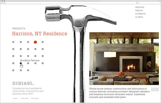
2.) DiBiasi Construction Website
The site functions as an online brochure for a family-owned construction firm, showcasing projects and providing basic company information. The choices of bold iconography and photographic image elements, together with a strong layout grid, geometric visual elements and an industrial, slab-serif typeface all allude to the precision of the company’s work, nations of architectural detail and tools, and the family’s heritage—in a nod to Italian International Style modernism.
Global navigation was minimized at top right to provide maximum area for content; the content area is divided roughly in half to provide a place for sub-navigation within a specific content area to the left, and selected, in-depth content to the right. The grid is structured to support this left-right configuration throughout, but allows for flexibility when content demands a slightly different solution.
3.) Spring of Freedom, Summer of Fear
This poster promotes the opening of a theatrical drama that takes place in Tehran, Iran around the time of the 1979 Islamic Revolution—which happened to coincide with the fall of the Persian New Year, Nowruz. One of the chief symbols of that holiday is the hyacinth, a symbol of renewal and fertility associated with Spring.
The symbolic flower is represented as a cluster of grenades, suggesting the dualities of celebration and fear, life and death. Rendering the flower in a reductive, iconographic form gave it an engaging, contemporary, and decorative quality and, further, cast it in a pattern form typical of Iranian ceramic decoration.
The fundamental design issues here are those of symbolic representation, image manipulation and style as vehicles for specific messages; the color language is borrowed directly from Iranian ceramic work and so is culturally relevant.
While the informational typography is set in a serif to add delicacy and detail, the poster’s titling manipulates a bold, organic sans serif typeface that reflects the script-like drawing of Arabic writing (further enhanced by added diacritical marks characteristic of that language) and visually corresponds to the image elements’ varied linearity and mass.
Think you might want to be a graphic designer? Are you a graphic who’s looking for fresh inspiration? Learn the Fundamentals of Graphic Design from Timothy Samara and make stuff that inspires you.
You Can Be a Designer: Start With These Fundamentals
Share:

Tuesday, July 2, 2019

The Top 6 Design Moments Of 2019


The Top 6 Design Moments Of 2019

2019 was an interesting year for sure – one dominated by politics and controversy. However, for design, we kept ourselves busy making the world just a little more beautiful whenever and wherever we could. Here are some of the top trends and moments we saw this past year.
The Top 6 Design Moments Of 2016
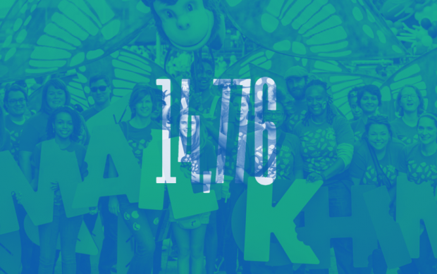
1.) Color Overlays
This treatment appeared on photos everywhere. Some of the many examples include NYC’s Pride 2019 site(below) and MailChimps Year in Review (also below).
The Top 6 Design Moments Of 2016
2.) All things reminiscent of the 80’s
The graphic shapes and colors from the 80’s made a comeback, as seen in this Spotify campaign (below). And let’s not forget the 80’s inspired Netflix show, Stranger Things which was hugely popular this year. Not to mention the show’s opener which inspired the type personalization site Make It Stranger.
The Top 6 Design Moments Of 2016The Top 6 Design Moments Of 2016
3.) Google’s Material Design
Although it was released in 2015, it became commonplace in 2019 among digital designers (and is a beautiful site to behold). Google’s guide establishes a visual language that ‘synthesizes the classic principles of good design with the innovation and possibility of technology and science.‘ It’s an update of the flat design we saw in the previous years with the addition of light and shadow as well as depth (for interface purposes). Though Google created the guide for web and mobile design, we see the same principles and flat design aesthetic showing up in other formats.
The Top 6 Design Moments Of 2016
4.) Design Software Gets Competitive
In a space where Adobe has reigned supreme for years, we suddenly saw their dominance threatened bySketch. Sketch is a vector-based software (currently only available for Mac),  popular with UX and product designers that are quietly becoming industry standard for web-related design. Adobe responded by launchingAdobe XD, still in Beta.
Screen Shot 2016-12-21 at 9.40.07 AM
5.) Lettering + Photography
Lettering continues to trend, and we saw many instances of highly refined brush and script styles combined with photography (below Jessica Hische for IL magazine, and Erik Marinovich for Propel).
The Top 6 Design Moments Of 2016
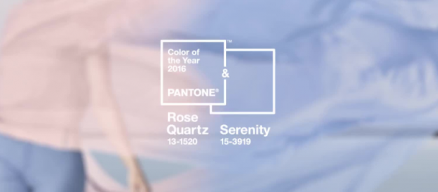
6.) Color of 2019
Pantone’s color of 2019 was a combination of two colors, Rose Quartz and Serenity.The Top 6 Design Moments Of 2016“As consumers seek mindfulness and well-being as an antidote to modern day stresses, welcoming colors that psychologically fulfill our yearning for reassurance and security are becoming more prominent. Joined together, Rose Quartz and Serenity demonstrate an inherent balance between a warmer embracing rose tone and the cooler tranquil blue, reflecting connection and wellness as well as a soothing sense of order and peace.” We didn’t see much of this throughout 2019, but their pick for 2020 is promising:The Top 6 Design Moments Of 2016
“Greenery bursts forth in 2020 to provide us with the reassurance we yearn for amid a tumultuous social and political environment,” said Leatrice Eiseman, the executive director of the Pantone Color Institute. “This is the color of hopefulness, and of our connection to nature. It speaks to what we call the ‘re’ words: regenerate, refresh, revitalize, renew.”
The Top 6 Design Moments Of 2016

Share:
 
thehillel.org Directory