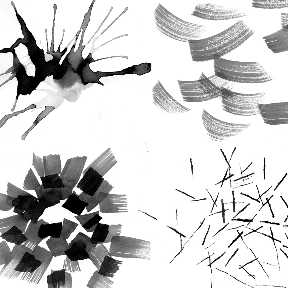
When talking about drawing for graphic design projects, we’re very often talking about a digital process. We’re so used to sitting in front of our computers, plugging away at pixels in Photoshop and Illustrator, that we sometimes forget to step away, grab a pen or pencil, and just draw. Here, we provide six simple drawing practice exercises that revolve around drawing for graphic design. These were pulled from Timothy Samara’s book on that subject. Timothy teaches Graphic Design Fundamentals at CreativeLive and his exercises will help you get started, and hopefully, breathe new life into your work.
1. Positive/Negative
This study trains the eye to tell form from space and pick out different levels of value.
1. Choose a simple object to draw. This can be just about anything you’ve got lying around: a cup of coffee, a pair of scissors, or a desk chair should do nicely.
2. Instead of trying to draw the object itself, draw the negative space that surrounds the object. Define the shape with contoured fields of color rather than lines.
3. Now the actual shape of the object should be defined, so go in and add details using pencil or a lighter charcoal to create different values. Add each level independently, beginning with shadows. In each iteration, increase the number of levels between black and white.
2. Form Language: Motif and Evolution
This quick study starts with original mark-making, then turns it into a motif through repeated movements.
1. Using any medium—pencil, brush, marker—make repeated, unique movements to create a rhythmic motif.
2. On a larger sheet of paper, repeat the motif over and over again to create a pattern that seems balanced and stable. The motif should retain its individuality, but no instance of it should optically disconnect or be emphasized more than any others. The field of texture it builds should seem continuous and undisturbed.
3. Finally, repeat the motif at different scales, using different media, and different values. Number the reiterations in each stage and date the sets. Periodically revisit the study and use different motifs to build a library for reference.
3. Rough Traces: Mass & Contour
This study helps to understand how to connect gestural language and pictorial depiction to introduce stylization at a basic level.
1. Choose a photo of an object, figure, or scene.
2. On tracing paper, quickly rough in the subject’s masses. Work with the image at a reduced size so that the medium no matter how controllable, captures essential mass shapes as bluntly and directly as possible. Use a combination of media or multiple values or colors for different masses.
3. In the next stage, focus on the image’s contours, outlining its major shapes. Using a continuous line, draw the contours without lifting the tool from the surface, creating a loopy network of connective contours.
4. Icon Studies
This study develops skill with simple pictorial reduction and stylization, through observation and editing skills.
Choose an animal or common object as a subject. The goal here will be to achieve an important distinguishing characteristic of an icon that is nonspecific. An icon of a clock, for instance, should not identify it as a certain kind of clock, but instead capture the neutral, universal aspects of all clocks.
Do a couple of different versions from different angles and compare them to see which is most recognizable and combine different aspects to change the silhouette.
5. Nonpictorial Narrative: Gestural Field
In this study, use your imagination to create emotional gestures through drawing.
1. Using a medium of your choice, make 2 sets of marks that depict contrasting emotions. Avoid using common clichés and symbols like hearts and stars, and focus on visualizing opposite emotions such as anxiety and joy.
2. Develop several variations for each emotion.
3. Compare and contrast your variations, noting which characteristic identifies each and sets them apart. Consider how these marks signal different emotions to you and how that could affect your work on future projects.
6. Stylization: Putting it all together
Using the steps above, create a narrative that reinforces the relationship between form and meaning.
Combine a variety of stylistic, pictorial motifs from the previous exercises to communicate a more meaningful narrative. Arrange a selection of three images and juxtapose certain elements to create different moods and meanings. By playing with the different studies and their interactions, you can create different stories and meanings for each. It’s a fun way to explore different mediums and not get hung up on tiny details.
Join us to learn everything Photoshop during Photoshop Week 2018 with 20 seasoned experts from the field. RSVP Today.


Branding is a way of identifying your business. It is how your customers recognise and experience your business. A strong brand is more than just a logo — it's reflected in everything from your customer service style, staff uniforms, business cards and premises to your marketing materials and advertising.
ReplyDelete